I'd been putting my own website redesign off for years, and one of the reasons was always the same: I would open a blank page, freeze, and end up with another centered heading on a white background. Writing the code was never the problem. Deciding what it should look and feel like was.
I can build software, and I can usually tell when an user experience feels right, but making it look good does not come naturally to me. Since this time we have more tools at our disposal, with the surge of new AI tools some even centered on design like Claude Design...it seemed the ideal time to learn something while building. I tried to treat Claude Design less like a tool that would design a site for me and more like something I could use to work through ideas: sketch, react, adjust, repeat.
Step 1 — Started "ugly"
As I'm more of a visual person and also wasn't sure what I want the final version to look like, I've started with wireframes: rough, hand-drawn-looking layouts with no color and simple placeholders where the real content would go. When something looks unfinished, it's easier to talk about the structure instead of getting distracted.
I asked for a few different directions for the whole site at once, laid out side by side so I could compare them.
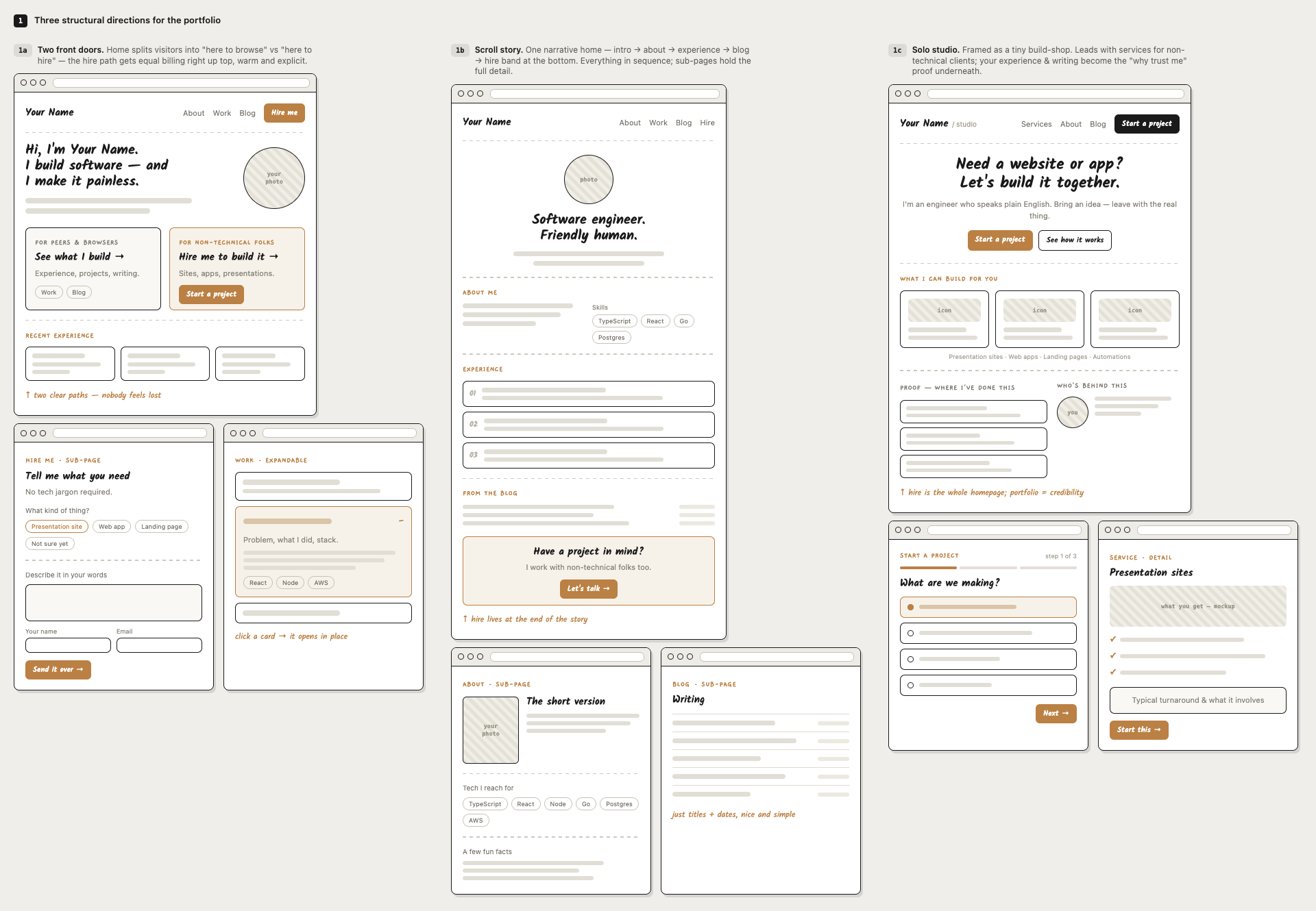 Three structural directions for the homepage, before any styling.
I picked the one that felt closest to me, and then I asked to flesh only that one out. Having one direction to build from made the rest of the process much easier, and also allowed me to focus also on the subpages.
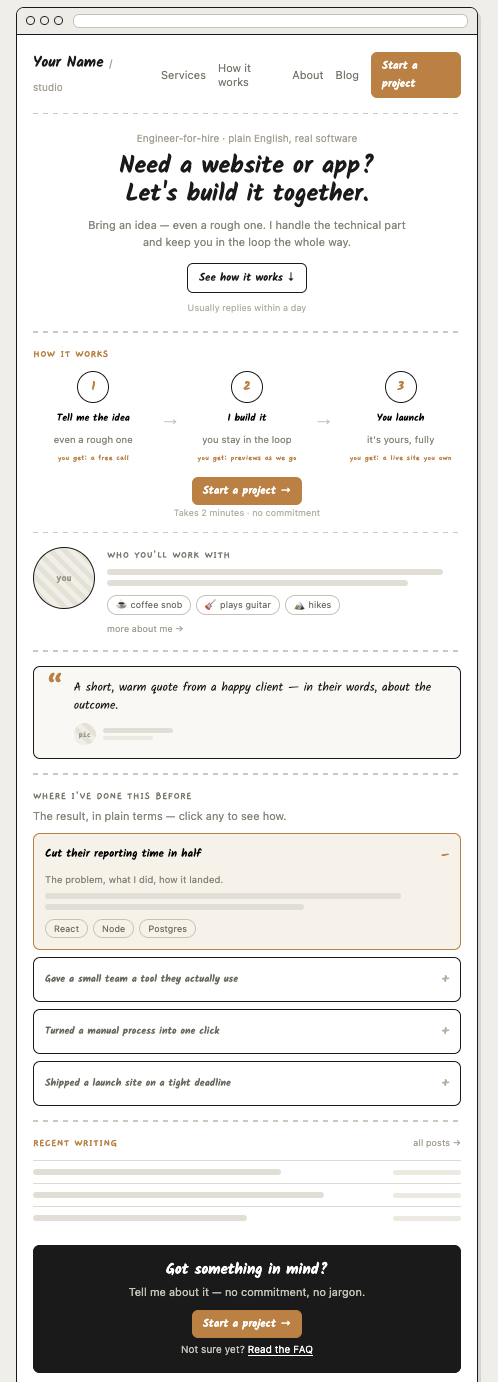 The same layout direction, with the visual details filled in.
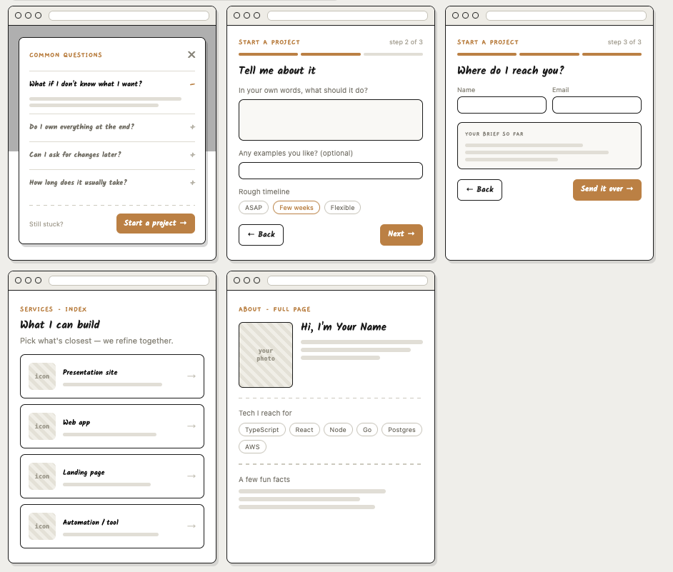 Every subpage wireframe with some content filled in.
Step 2 — Make it look like a real page
Once the structure felt right, I asked for a more finished version. This is where I usually get stuck, so I focused on describing the feeling I wanted instead of pretending I had a visual system in my head. I wanted it to feel warm, grounded but with a bit of my personality.
Initially went for a dark background with light text, but it felt too heavy. I asked for a lighter version, and that felt way better.
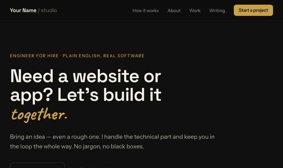 Initial dark prototype
The design that came back used a warm paper background, dark text, one green accent, and a handwritten font in a few small places. It was simple, but it felt more personal than anything I would have made on my own.
That was where the wireframe helped most. The big layout choices were already made, so colors, type, and spacing became the next layer of decisions instead of one more thing competing with everything else.
Step 3 — Edit what does not work
The first polished version was not the answer, but it gave me something specific to push against. Because I was not attached to every choice, it was easier to say what felt generic, repetitive, or out of place. A few small edits changed the page more than I expected.
Cutting the "How it works" section
I had a three-step "How it works" block. It looked fine, but it did not say much. "Tell me the idea → I build it → You launch" was accurate and looked good initially, but it was also generic. It did not add any real value to the page.
Making the sections feel less repetitive
At one point every section had the same pattern: small label, big headline, thin divider line, repeat. It wasn't broken, but it started to feel a bit repetitive.
Played with some changes but ultimately removed a few repeated dividers, gave one section a different background, and changed how a couple of sections opened. The structure stayed the same.
Moving the testimonial
I moved the testimonial after the work experience. It made more sense there: show the work first, then put the testimonial next to the thing it was supporting.
The helpful part wasn't that it designed for me. It gave me something concrete to react to.
Step 4 — The practical details
The useful details were not only on the desktop version. The mobile menu worked, the grids stacked in a way that still made sense, and the "Start a project" form had screens for the states I would normally figure out later.
The empty headshot slot helped too. Instead of pretending I already had the right photo, the design used a simple placeholder that made it clearer what kind of photo I should take.
I kept the logo and brand simple in the end, but the brand study was still useful because it put a few options next to each other. Seeing them together made the choice feel more deliberate, even when the answer was to keep things restrained.
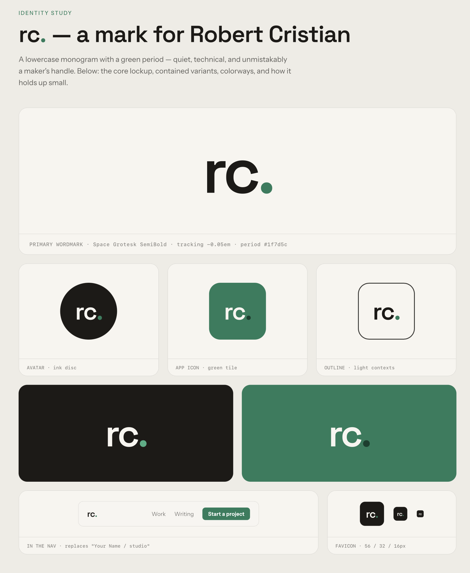 Brand identity study
Should you skip the designer?
Here's how I think about it now.
Where Claude Design helped me most
Speed. Went from nothing to a finished, responsive, multi-page direction in an afternoon of back-and-forth. A designer engagement would have taken longer, especially if I wanted to see more smaller changes.
No coordination overhead. No scheduling calls, no waiting a day for a revision, no explaining the same small change a few different ways. I could try "what if we cut this whole section" and see the result right away. Quick feedback.
It met me where I'm weak. I can't easily create a visual direction from nothing, but I can react to one. Getting something concrete to critique turned design into more of an editing process, which feels much more natural and easier to me.
It covered the practical details. Responsive breakpoints, form states, and a dev handoff spec were all part of the process.
Where a real designer still wins
Original brand and identity. I got a good-looking site. I did not get a full brand: no custom logo, no custom visual system, no identity that only this site could have. A good designer can create that from the ground up. I mostly made good choices inside a strong starting point. For a company trying to stand out, that difference matters.
Judgment when things are unclear. A seasoned designer brings judgment, pushes back, owns the outcome, and catches the subtle things: spacing, bad line breaks, the detail that's technically fine but still feels off. In this process, I was still the final filter. A professional would catch things I would miss.
Strategy, not just screens. The best designers with good domain knowledge ask hard questions before drawing anything: who is this for, what should it make them feel, what is the business trying to do? I brought most of that context myself. If you do not have it, a design tool will not supply it for you.
Specialist work. Illustration, motion, photography, accessibility audits, print collateral: all of that work is real. It was outside the scope of what I needed, but it matters if your project depends on it.
Neutral
Cost. I put this as neutral because the comparison is not as simple as it first looks. Claude Design is not cheap, and while rough wireframes cost less, detailed design iterations can burn through a subscription quickly. Hiring a designer has its own uncertainty: rates vary a lot, and price does not always tell you whether someone is the right fit for the project.
How I'd actually decide
I think that anything where "clean and credible" is the bar, this approach can be very practical. It was faster than hiring a designer, and it produced better work than I would have made alone.
If it's a company's core brand identity, or a product where design is the edge, hire the designer. You can still use tools like this to move faster inside their direction, but I would not treat it as a replacement.
So I don't really see this as designer versus tool. It's more that some work I could not justify hiring a designer for is now something I can handle well enough myself. The designers I would hire are still worth it for deeper design work.
Closing thoughts
That is probably the main thing I learned from this. I did not need the tool to be a designer for me. I needed it to get me past the blank page, give me something concrete to react to, and help me make decisions one at a time.
If you are an engineer in the same position, that might be the useful part too. Do not expect it to hand you taste. Use it to create options, notice what feels wrong, and keep editing until the work feels like yours.